
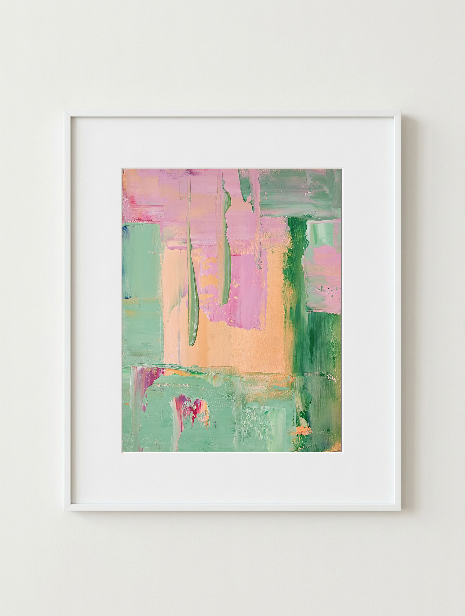
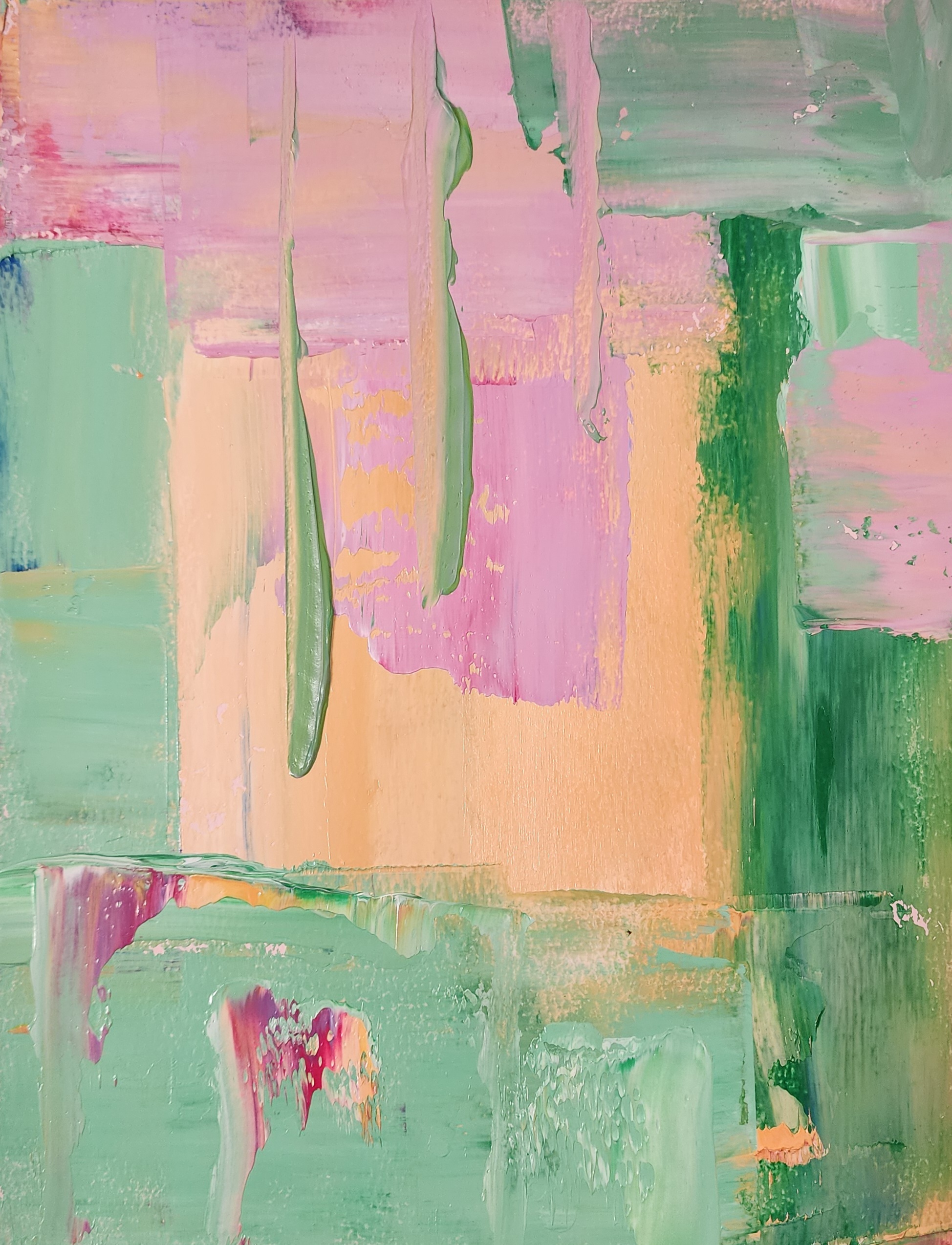
In Mad Magazine, I wanted to capture the irreverent, nostalgic charm of classic comic-strip satire—where pastel retro hues, playful folds, and quirky vertical ridges come together like a visual punchline waiting to be unfolded. Built through crisp, overlapping blocks and raised impasto trails of the palette knife, the composition balances soft, sugary tones of bubblegum pink, peach, and mint green against bold vertical strokes of emerald.
Across the center, warm rectangular planes of apricot and lilac overlap like layered newsprint pages, sliced downward by three slender, raised ridges of sage green and lavender paint that feel almost like the iconic “fold-in” creases of a back-cover gag. Framing the edges, cool blocks of seafoam and deep forest green anchor the right and lower borders, punctuated along the bottom register by playful drips and scrapes of magenta, coral, and pale mint. For me, this piece is about wit, nostalgia, and subversive humor—celebrating the timeless joy of smart satire wrapped in bright, candy-colored pop sensibility.